AILD;78053 wrote:
Well that’s pretty true. You don’t have to worry about ajusting the colors for the most part
Here’s my red bear in black:
<div class=“bbcode_center” >
http://www.americanheraldry.org/forums/attachment.php?attachmentid=715&d=1276203203
</div>
I never said it was impossible, just more difficult. You can get a decent 2D black animal, but try doing one with any amount of shading. Then it gets harder.
Top heraldic artists work in gouache and similar media and mix their own colors to get the right effect. The picture below, from Carl Pritchett’s matriculation of his Irish arms at Lyon Court, shows what can be achieved, albeit in diapering and shading the shield rather than with an animal:
http://www.clankeith.org/heraldry/Carl - Arms-small.jpg
As reported today on the HSS forum.
I also think I managed reasonably well to show depth in the raven in Washington’s arms and the bear and horse in Ronald Reagan’s using black with highlighting rather than dark gray with shading. This is all digital, however, not pigment on paper.
http://www.americanheraldry.org/pages/uploads/President/Wash-mid.jpg
http://www.americanheraldry.org/pages/uploads/President/reagan.png
Michael F. McCartney;78055 wrote:
By now, to do a proper refrigerator test you’ll need to rent the kitchen section of a large appliance store!
A number of very nice options. Comments in no particular order:
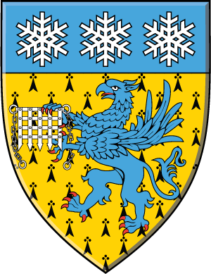
In Patrick’s otherwise quite nice rendition, the red outlines of the black-on-black griffin crest would IMO better be white outlines—better contrast.
Thanks, but it really is a pretty lame rendition. I just slapped it together using mostly MS Paint and clip art. I agree the outlines should be white, but they look really nasty that way on this particular Griffin.
Michael F. McCartney;78055 wrote:
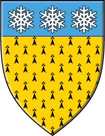
The (perhaps by now abandoned) per fess fir tree (is that how we should say it?) between three snowflakes counterchanged, would IMO be better in blue & white or black & white—yellow snow isn’t IMO a particularly attractive image.
Yep, I think that’s how we say it. Yellow snow isn’t too bad, as long as you’re not planning on eating it.
Michael F. McCartney;78055 wrote:
In the various designs involving the chevron engrailed, IMO three snowflakes is better than two flakes in chief and whatever else in base—though in the black & white version, the cross flory does look quite nice. Don’t know why it doesn’t look as nice—to me at least—on the light blue field.
I’m rather liking the 2 flakes in chief and the light blue doesn’t really offend me.
As I said…it CAN be done, it’s just more difficult to do if the average person wants to try to emblazon their arms themselves. I have no doubt an actual artists is capable of doing it.
This thread has become a discusion of bleu celeste while there is a thread in the open forum currently discussing orange.
It seems to me that orange can be kept distinct from red, but as light blue is an acceptable depiction of azure, it would never be possible to be certain that the blazon deduced from an emblazonment using light blue is correct. Not that I’m advocating orange (haven’t decided yet), but at least there you’re getting something.
Azure is azure. To me trying to be exact on the exact shade of azure is borderline rediculous. What’s next, giving the code for each exact color like #C0C0FF or #BEBFD8. Part of what’s interesting with having other people emblazon your arms is seeing where their artistic style leads them. If you give too exact of instructions, there’s not a whole lot of point.
Well, in an attempt to resuce the thread from bickering about bleu celeste (which I feel in part responsible for because of my decision to use it in at least some of the proposed designs) I am going to throw out some more proposed modifications to the semi-finalist designs for comment:
Design #1 (snowflakes in chief design)
What if I eliminated the gryphon from the shield altogether and did either:
Erminois a greek cross fleury bleu celeste three snowflakes argent on a chief bleu celeste
or
Erminois three snowflakes argent on a chief bleu celeste
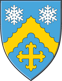
Design #2 (chevron engrailed designs):
What do people think about making the cross fleury in base gold as opposed to silver in the bleu celeste version?
What about making both the chevron and the cross fleury gold instead of argent in the sable version? I know that destroys the beautiful simplicity of one color, one metal per coat but I have a strong perference for gold with black but still want to retain the snowflakes. I think perhaps that I am worried about a lack of variety in the rendering of the sable version of these arms and the overall lack of color, so to speak, in the acheivement.
Would an azure or bleu celeste gryphon for a crest look totally out of place with the sable version?
Thanks for any input!
Travis
tsmith;78208 wrote:
...I am going to throw out some more proposed modifications to the semi-finalist designs for comment:
Design #1 (snowflakes in chief design)
What if I eliminated the gryphon from the shield altogether and did either:
Erminois a greek cross fleury bleu celeste three snowflakes argent on a chief bleu celeste
Much better than the griffin if you want to use the Erminois.
<div class=“bbcode_center” >
http://a.imageshack.us/img814/6708/smithtravishiscross.png
</div>
Quote:
or
Erminois three snowflakes argent on a chief bleu celeste
<div class=“bbcode_center” >
http://a.imageshack.us/img13/3917/smithtravishisnocross.png
</div>
Quote:
Design #2 (chevron engrailed designs):
What do people think about making the cross fleury in base gold as opposed to silver in the bleu celeste version?
I think I prefer when the charges are all the same color when different from the chevron. The bottom charge just seems to get lost when it’s the same color as the chevron and different from the top charges.
<div class=“bbcode_center” >
http://a.imageshack.us/img693/4379/smithtravishis4crossblu.png
</div>
Quote:
What about making both the chevron and the cross fleury gold instead of argent in the sable version? I know that destroys the beautiful simplicity of one color, one metal per coat but I have a strong perference for gold with black but still want to retain the snowflakes.
Same comment as above.
<div class=“bbcode_center” >
http://a.imageshack.us/img837/6044/smithtravishis4crossbla.png
</div>
I think I’d try this one.
<div class=“bbcode_center” >
http://a.imageshack.us/img838/6044/smithtravishis4crossbla.png
</div>
Quote:
I think perhaps that I am worried about a lack of variety in the rendering of the sable version of these arms and the overall lack of color, so to speak, in the acheivement.
Would an azure or bleu celeste gryphon for a crest look totally out of place with the sable version?
I wouldn’t worry about either a lack of variety or color in an achievement. That is easily remedied with crest, helm lining, scroll backing, etc., and should be anything to worry about.
As to the color of a gryphon crest in the black version, blue (light or dark) can look great or horrible depending on the artwork, but then, so can any other color. I wouldn’t sweat it, though I think I would have a preference for a light blue I think if you were to go that route.
It seems my efforts to resuce the thread from the all consuming discussion of bleu celeste have failed ![]() Carry on!
Carry on!
Travis
tsmith;78247 wrote:
It seems my efforts to resuce the thread from the all consuming discussion of bleu celeste have failed
Denny,
No worries! On some level I enjoy the discussion about bleu celeste and I’m still thinking through what to do about that issue. However, for your penence ![]() (from one devout Catholic to another), do you have any thoguhts on either of the two basic designs I’ve proposed (gryphon vs. chevron)?
(from one devout Catholic to another), do you have any thoguhts on either of the two basic designs I’ve proposed (gryphon vs. chevron)?
As a side note, are you still taking commission? I’ve enjoyed the examples of your work you’ve post in the past. If you want to send me a private message to discuss that issue I would appreciate it!
Kenneth,
I suppose everyone does have to have something to do while the fridge testing is going on. No need to separate the bleu celeste discussion out! I’ve never been scared of healthy debate, I wouldn’t be a very good lawyer if I were!
Cheers,
Travis
yes Travis i do take commissions, but not many, or as many as i used to. in addition to coaching three sports, being the assistant AD at the school and last year the art teacher and this year too if we can get our pastor to agree that the kids should have art in the curriculum again, i still do emblazonments. as i said a long time ago i’m calling it quasi-retirement. not complete retirement. don’t know that i could ever give it up completely. so, yes, shoot me a PM and we can talk about it there if you’d like. due to my schedule i take longer to do them than some of my friends like Xavier and Andy who seem to do them at PC speed! lol.
Well, I have been doing some fridge testing and while the engrailed chevron design is beautiful and simple I find myself leaning in the direction of Design #1, as depicted below but with a different crest.
Kenneth Mansfield;77845 wrote:
This one, for some reason, is growing on me. It looks like something that might actually come from the CHA these days. Minnesota’s up near Canada, eh? I think I’d stick with the demi-Gryphon for the crest, though. Something like this:
<div class=“bbcode_center” >
http://img707.imageshack.us/img707/8196/smithtravishis.png
</div>
I know that many here have shared concerns about the erminois field with the gryphon but I find myself very partial to ermine spots and a little bored with the plain Or field behind the gryhpon. To blatantly swipe what I think is a rather clever idea from a discussion on another individuals arms that has been ongoing in the non-members heraldic design portion of the forum and over at the IAAH forums, what about the idea of a double Tressure erminee counter erminee sable in this design instead of the erminois field? Better or worse? Too crowded with the chief? I am really looking for a way to elegantly incorporate ermine spots in this design and help would be appreciated.
Thanks!
Travis
I don’t have any problem with the shield as illustrated. And in that particular illustration, the griffin isn’t nearly as much a problem as the portcullis, which can be remedied somewhat by simplifying it.
<div class=“bbcode_center” >
http://a.imageshack.us/img17/4763/smithtravishisb.png
</div>